Data visualization is a powerful tool that plays a crucial role in market research. It is the art of presenting data in visual formats like charts, graphs, or infographics. However, it goes beyond just aesthetics.
It is an effective tool for distilling information, translating complex information, and uncovering meaningful trends that might not have been immediately transparent in the raw data.
At Limelight Insights, we pride ourselves in taking complex data and translating it into more digestible, easily understood and communicated, data visualizations that ultimately help our clients make more informed business decisions.
Three Key Benefits of Data Visualization
Some of the key benefits of data visualization include:
1. It simplifies communication about, and enhances understanding of, key findings: By representing data visually, complex concepts and findings can be conveyed more intuitively, making it easier for stakeholders to grasp and interpret the information. You can easily send an infographic to a key stakeholder or share a chart with your colleague in a different department to enhance their understanding of a project. Data visualization provides bite-sized, easily understood visuals that communicate key study findings.
2. It promotes collaboration and alignment across teams and departments: When data is visualized in a clear and accessible way that all can understand, stakeholders from different backgrounds and levels of expertise can collaborate more effectively.
3. It facilitates data-driven decision-making: By providing clarity and context to the data and insights presented, businesses can make better decisions when all cross functional team members easily understand market research insights.
Types of Data Visualization and Examples
While different market research firms have their own data visualization methods/practices, some of the common methods we use at Limelight Insights include:
- Word Clouds
- Perceptual Maps
- Decision-Making Journey Maps
- Process Mapping
- Persona Profiles
- Report Cards
- Insight-Specific Visuals
- Metaphor Exercises
- Mind Maps
*Note: The visuals provided below are simply examples. They are de-branded and some even contain “dummy data” or placeholder data to protect client confidentiality while providing a glimpse into our data visualization techniques.
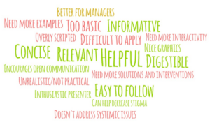
Word Clouds – Word clouds visualize data by presenting key words or phrases in a bubble or cloud. The size of the word indicates its frequency or importance within the findings.
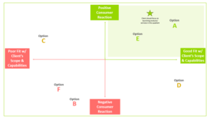
Perceptual Maps – Perceptual Maps provide a visual representation of the competitive landscape and can be a helpful tool for strategic decision-making and helping brands identify gaps in the market.
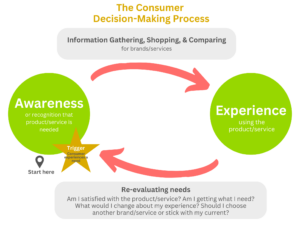
Decision-Making Journey Maps – Decision-Making Journey Maps offer a visual representation of the steps/stages individuals go through when making decisions. They help to provide a comprehensive understanding of the customer experience and aid in identifying opportunities to optimize interactions or address consumer pain points.
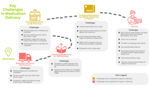
Process Mapping – Process Mapping provides a visual representation of the steps, activities, or interactions involved in completing a specific process or workflow. They are often helpful in identifying areas for improvement in a process, inefficiencies, or bottlenecks.
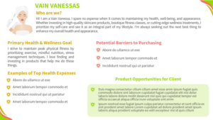
Persona Profiles – Persona profiles are detailed representations of fictional “characters” that represent real segments of your target audience/customer base. They are informed by the findings of the research and help brands understand a particular segment’s wants, needs, preferences, motivations, and pain points.
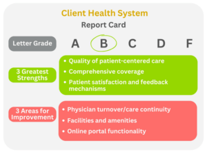
Report Cards – Report cards provide a visual summary of your consumers’ evaluation of your brand, specific marketing initiatives, campaigns, communication, etc. They typically provide an overall assessment (such as a letter grade), identify strengths and areas for improvement, and provide a space for structured evaluation of any additional KPIs of importance to you/your brand.
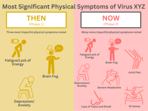
Insight-Specific Visuals – Insight-specific visuals are visual representations or graphics that are specifically designed to convey key insights derived from your data. These are created with the intent of presenting more complex information in a clear, concise, or impactful manner that allows stakeholders to quickly grasp and understand key insights/findings.
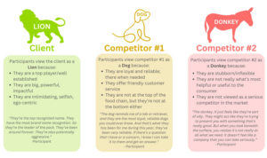
Metaphor Exercises – A metaphor exercise is a projective technique utilized in market research to help participants reflect on their own thoughts, feelings, and experiences. This tool enables participants to more easily verbalize their underlying thoughts and feelings than if they were asked a question outright. Participants may be asked to select an image or an animal from a list of provided images/animals that best exemplifies their thoughts and feelings about a brand, product, service, etc.
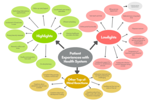
Mind Maps – Mind maps are visual tools that represent ideas, concepts, or information in a hierarchical, but interconnected format. At the center of the mind map is a central theme, idea, or concept (e.g., patient experiences with a health system). Various branches extend outward from the central theme which represent different categories, subtopics, or ideas (e.g., highlights, lowlights, and other top-of-mind reactions). The branches coming off of these subtopics contain keywords or phrases that explain or exemplify the subtopic.
Let the experts at Limelight Insights provide you with clear, concise, and actionable insights that help you more easily understand and communicate the key findings of your market research.
For your next market research initiative, look to Limelight Insights. Call (240) 380-1500 or email info@limelightbyshugoll.com.

